The wonderful Emily from Blogaholic Designs, who designed the previous look, got the nod for this one too, and I love what she did! Darker and sexier than the older look, the header now has my author tagline "Romance...from sensual to decadent...whatever your desires" and don't miss the signature below each post. I love that!
The website design will change soon too, and for that I'm going even sexier. Here's a teaser of what that header will have:
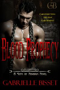
In other dark and sexy news, the edits for Blood Betrayed are back from the editor, and I've completed the initial run-through clean up/edit. I type very fast (about 120 words a minute), but I can only sustain it for a little while (no more than a chapter a day). I hate typing, though, so I always push it too long and as a result, my first draft is riddled with typos. My editor must hate that, but I send it to her as it's typed. She's got an eagle eye for such things, so when it comes back to me, it's now riddled with yellow. I did the clean up edit last night, and this weekend the structural edit begins.
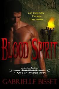
And the third book, Blood Spirit, is shaping up very nicely. Last night as I was writing, I had an idea for one of the Sons that's going to add a great layer of tension, so I can't wait to get to that. Saturday and Sunday are editing and writing, so it's looking to be a terrific weekend for me.
I hope you have a wonderful weekend!





















10 comments:
Oh yes! beautiful I loved the clock on the old layout, but you're right...this is so sexy. ;)
~ Aithne
Looks nice, I really like it!
And the chain by the end of the post is perfect!
Thanks guys! Nat, the chain came in the scrapbook kit, and I thought it would look great as the post divider. :)
Very nice!
I must admit that I loved the banner you had for your old design but this is cool too. :)
Pam
The new design looks fantastic...I think you did a wonderful job.
Your new design looks awesome. Definitely on the dark and sexy side.
Thanks everyone! I love it too :) Those vampire men are having a dark effect on me. ;)
Great look Gabrielle! So much more... you! Or at least the you I imagine :) X Looking forward to the website.
Thanks, Shah! :)
Post a Comment